

Days on Market Explained: The Demand Signal Most Property Investors Miss
📊 TL;DR - Key Takeaways
- Days on Market (DOM) is one of the most powerful leading indicators in property investment
- DOM typically changes 3-6 months before prices shift — giving you advance warning
- Falling DOM = rising competition = likely price growth ahead
- Rising DOM = weakening demand = potential price stagnation or decline
- Use rolling 90-day averages to filter out noise and spot genuine trends
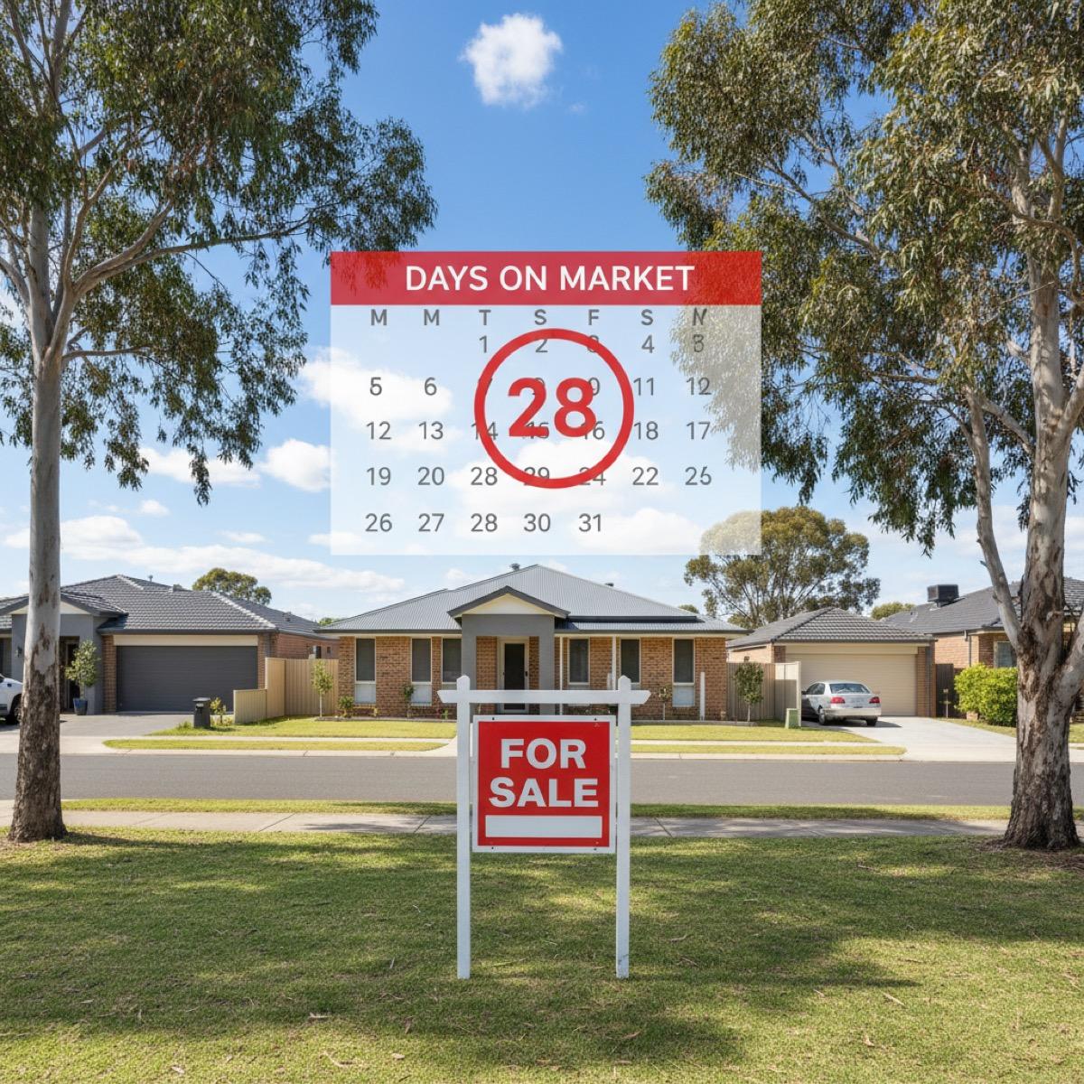
What Days on Market Actually Measures
Days on Market (DOM) is the number of calendar days between when a property is first listed for sale and when it's sold (or withdrawn).
Unlike median prices (which tell you what happened), DOM tells you how quickly buyers are acting — which is a direct measure of demand intensity.
March 2026 Snapshot: The national average DOM is currently 31 days — down from 38 days in December 2025, signalling strengthening buyer competition despite the RBA holding rates at 4.35%.
Why DOM is different from price data:
- Price = what happened last month (lagging indicator)
- DOM = what's happening right now (leading indicator)
When DOM starts dropping, it means buyers are making faster decisions. That urgency typically translates into price growth 3-6 months later.
Why Days on Market Is a Leading Indicator
DOM changes before prices do because it captures buyer psychology in real-time.
When demand strengthens:
- Buyers act faster (DOM drops)
- Competition increases (more offers per property)
- Vendors gain pricing power (prices rise)
When demand weakens:
- Buyers hesitate (DOM rises)
- Properties sit longer (fewer offers)
- Vendors reduce prices (discounting increases)
Real Example: Melbourne's DOM Trend (2024-2026)
| Period | Avg DOM | Change | Median Price (3 months later) |
|---|---|---|---|
| Q2 2024 | 45 days | — | $845,000 (Q3 2024) |
| Q3 2024 | 38 days | ↓ 15.6% | $871,000 (Q4 2024) +3.1% |
| Q4 2024 | 34 days | ↓ 10.5% | $889,000 (Q1 2025) +2.1% |
| Q1 2025 | 29 days | ↓ 14.7% | $903,000 (Q2 2025) +1.6% |
| Q2 2025 | 32 days | ↑ 10.3% | $898,000 (Q3 2025) -0.6% |
| Q4 2025 | 27 days | ↓ 18.2% | $891,000 (Q1 2026) -0.8% |
Source: Domain Group, CoreLogic
Notice the pattern: When DOM dropped sharply in Q3 2024 (38 days), prices rose in Q4 2024. When DOM increased in Q2 2025, prices flattened 3 months later.
Key Insight: DOM is like a canary in the coal mine — it warns you of market shifts before they show up in the headline price data.
How to Interpret Days on Market Data
Fast Market (Under 25 Days)
What it means: Extremely competitive buyer market. Properties selling quickly, often with multiple offers.
What it signals:
- Strong demand relative to supply
- High likelihood of price growth in next 3-6 months
- Vendors have pricing power
- Potential for buyer FOMO (fear of missing out)
Investment implication: Entry opportunity if fundamentals support long-term growth. But be cautious of overpaying in hot markets.
Current examples (March 2026): Adelaide CBD (19 days), Perth northern suburbs (21 days), Brisbane inner west (23 days).
Balanced Market (25-40 Days)
What it means: Neither buyers nor sellers have dominant control. Normal negotiation dynamics.
What it signals:
- Supply and demand in relative equilibrium
- Prices likely to remain stable or grow modestly
- Fair pricing required to transact
Investment implication: Low urgency. Good time to research thoroughly and negotiate without time pressure.
Current examples (March 2026): Sydney outer west (32 days), Melbourne southeast (35 days), Canberra (28 days).
Slow Market (Over 40 Days)
What it means: Buyer's market. Properties sitting longer, vendors becoming more flexible.
What it signals:
- Weak demand or oversupply
- Increased vendor discounting
- Higher risk of price declines ahead
- Possible structural issues (employment, amenity, or oversupply)
Investment implication: Investigate why DOM is high. Is it temporary (e.g., seasonal) or structural (e.g., declining population)? High DOM can signal opportunity or danger.
Current examples (March 2026): Regional Queensland mining towns (58 days), Darwin (51 days), some Melbourne fringe developments (47 days).
Common Mistakes When Using DOM Data
Mistake 1: Looking at Single Properties
One property sitting for 60 days doesn't mean the market is slow — it might just be overpriced or have issues.
Solution: Use suburb-level average DOM calculated across 30+ sales minimum. Picki calculates rolling 90-day DOM averages to smooth out outliers.
Mistake 2: Ignoring Seasonality
DOM typically rises in winter and over Christmas/January. A spike from 28 days in November to 38 days in January might just be seasonal — not a market shift.
Solution: Compare DOM year-over-year (e.g., March 2026 vs. March 2025) to filter out seasonal noise.
Mistake 3: Not Adjusting for Property Type
Houses and units often have different DOM patterns. Comparing them directly is misleading.
DOM by Property Type (National Average, March 2026)
| Property Type | Average DOM | Typical Range |
|---|---|---|
| Detached Houses | 29 days | 18-45 days |
| Townhouses | 33 days | 22-52 days |
| Apartments | 38 days | 25-68 days |
| Vacant Land | 52 days | 35-95 days |
Source: PropTrack, Domain Group
Solution: Always compare like-for-like (houses to houses, units to units).
Mistake 4: Treating DOM as the Only Metric
DOM is powerful but incomplete. Always layer it with other data:
- Vendor discounting: Are sellers accepting below asking price?
- Auction clearance rates: What percentage of auctions are successful?
- Sales volume: Are fewer or more properties selling overall?
- Listing volumes: Is supply increasing or decreasing?
How Picki Tracks Days on Market
Picki calculates DOM using rolling 90-day suburb-level averages, stratified by property type.
Why rolling 90-day averages?
- Filters out individual outliers (one slow sale doesn't skew the data)
- Smooths week-to-week noise (e.g., holiday periods)
- Provides statistically reliable trends even in lower-volume suburbs
What you see in Picki:
- Current DOM for the suburb
- 3-month trend (is DOM rising or falling?)
- Year-over-year comparison (adjusted for seasonality)
- Percentile ranking (how this suburb compares to others in the same city)
Example: Viewing Thornbury, VIC on Picki shows DOM at 26 days (down from 34 days 3 months ago), placing it in the 18th percentile for Melbourne — indicating high buyer competition.
Using DOM to Time Your Investment
Best time to buy: When DOM is starting to fall after a period of stagnation. You want to catch the market as it shifts from balanced to hot — before prices fully adjust.
Worst time to buy: When DOM has been low (<20 days) for 6+ months. At this point, the market is likely overheated and prices have already run up. You're buying at peak competition.
The DOM Investment Timing Matrix
| DOM Trend | Market Phase | Investment Action |
|---|---|---|
| ↓ Falling (fast) | Early growth | Strong buy — catch momentum early |
| ↓ Falling (slow) | Recovery | Buy — watch for stabilisation |
| → Stable (low) | Peak/plateau | Hold/caution — prices may have peaked |
| ↑ Rising (slow) | Cooling | Wait — demand softening |
| ↑ Rising (fast) | Decline | Avoid — or wait for bottom |
| → Stable (high) | Bottom | Research opportunity — why is it slow? |
Case Study: Using DOM to Spot Opportunities
Suburb: Torquay, VIC (Geelong region)
Period: August 2025 - March 2026
What happened:
- August 2025: DOM at 52 days (slow market, limited buyer interest)
- September 2025: Major employer (tech company) announced 300-person regional office opening in Geelong
- October 2025: DOM dropped to 41 days
- November 2025: DOM fell to 33 days
- December 2025: DOM hit 27 days
- March 2026: Median house price up 6.2% from August 2025 ($685K → $727K)
The opportunity: Investors who bought in September-October 2025 (when DOM started falling but prices hadn't moved yet) captured the growth before the market fully repriced.
Lesson: Track DOM alongside employment announcements, infrastructure projects, and population data. DOM changes first; prices follow.
What This Means for You
If you're researching suburbs by looking at median price trends alone, you're looking in the rearview mirror.
Action steps:
- Check DOM alongside price — if DOM is falling, price growth is likely coming
- Use rolling 90-day averages — single-month spikes can be noise
- Compare year-over-year — filter out seasonal patterns
- Layer with vendor discounting — falling DOM + low discounting = genuine demand surge
- Track DOM trends over time — set up alerts for suburbs you're watching
DOM is one of the few metrics that gives you advance warning of market shifts. Use it.
Frequently Asked Questions
Q: What is a good days on market figure?
A: This varies by market, but generally 20-30 days suggests a strong seller's market, 30-45 days is balanced, and 45+ days indicates a buyer's market. Always compare to the suburb's own historical average for context.
Q: How does days on market relate to property prices?
A: DOM is a leading indicator. When DOM falls consistently, prices typically rise in the following quarter as competition intensifies. When DOM rises, it often precedes price softening. It's one of the earliest signals of market direction change.
Q: Does days on market apply to rental properties too?
A: Yes — "days to lease" or "days on market for rentals" measures how quickly rental listings find tenants. Sub-14 days indicates extremely tight rental conditions. This metric works alongside vacancy rates to show rental market health.
Key Takeaways
- Days on Market measures how quickly buyers are acting — a direct demand signal
- DOM typically changes 3-6 months before prices — making it a leading indicator
- Fast markets (under 25 days) signal high competition and likely price growth ahead
- Slow markets (over 40 days) indicate weak demand or oversupply — investigate the cause
- Use rolling 90-day averages and compare year-over-year to filter noise
- Combine DOM with vendor discounting, sales volume, and fundamentals for complete analysis
Picki tracks real-time DOM data for every suburb in Australia, with historical trends, property-type breakdowns, and suburb comparisons built in. See which markets are heating up before the headline price data catches on. Start your free trial.
Sources: Domain Group Insights (Q1 2026), PropTrack Property Market Report (February 2026), CoreLogic Daily Indicators, SQM Research Listings Data (March 2026)
Explore days on market data for suburbs like Kirwan, QLD and Blacktown, NSW on Picki.