
Population Growth vs New Supply: The Metric That Reveals Where Housing Demand Outstrips New Builds
Why Population Growth Alone Doesn't Tell the Full Story
If you've ever researched a suburb and seen headlines like "Population booming in Western Melbourne" or "South-East Queensland set for massive growth," you'd be forgiven for thinking population growth automatically equals property price growth. It's one of the most repeated ideas in Australian property investing — and one of the most misunderstood.
The reality is more nuanced. Population growth matters, but only in the context of how much new housing is being built to accommodate that growth. A suburb adding 5,000 residents a year might seem like a goldmine — until you discover 6,000 new dwellings were approved in the same period. That's the difference between genuine demand pressure and an oversupplied growth corridor.
Key Takeaways
- Population growth alone is not a reliable indicator of property price growth — supply context is essential
- The population-minus-supply gap measures whether new housing keeps pace with incoming residents
- Suburbs with high population growth AND constrained supply tend to see the strongest rental and price pressure
- Oversupplied growth corridors can experience population booms alongside flat or declining property values
- Picki tracks both population projections and recent supply data at the suburb and LGA level to help investors assess this balance
The Supply Side of the Equation
Every quarter, the Australian Bureau of Statistics releases building approval data showing how many new dwellings have been greenlit across every local government area in the country. These approvals eventually turn into completions — new houses, townhouses, and apartments that hit the market and absorb some of that incoming demand.
When population growth outpaces new supply, you get a supply deficit. Existing housing stock faces more competition from buyers and renters. Vacancy rates tighten. Rents rise. Prices follow. This is the fundamental mechanism behind demand-driven price growth.
When supply outpaces population growth, the opposite happens. Even in suburbs with impressive headline growth numbers, an oversupply of new dwellings can dilute demand across a larger pool of available properties. This is why some of Australia's fastest-growing suburbs by population — particularly in outer-ring growth corridors — have historically delivered underwhelming capital returns compared to established suburbs with lower growth but tighter supply constraints.
How Picki Measures the Population-Supply Gap
Picki data shows the relationship between projected population growth and recent dwelling supply for every suburb and LGA in Australia. The platform tracks a metric called the population-minus-supply difference, which compares three-year population growth forecasts against recent dwelling approval and completion rates.
This isn't a single number you should use in isolation — it's a lens through which to evaluate other metrics. A suburb with strong gross rental yield becomes even more compelling when you can see that its population is growing faster than new housing can accommodate. Conversely, a suburb with a high yield but massive incoming supply might be offering that yield precisely because the market is pricing in future dilution.
What the Data Actually Includes
The population side draws on ABS population projections at the LGA level, which are then distributed across constituent suburbs. These projections use medium-series assumptions about fertility, mortality, and migration — they're not predictions of what will happen, but reasonable estimates based on established demographic trends.
The supply side uses building approval data, also from the ABS, tracking new dwelling approvals by type (houses, townhouses, apartments) at both the suburb and LGA level. Picki's analysis compares recent supply rates (typically the last 12 months of approvals) against projected population growth over the next three years.
The result is a percentile ranking that tells you where a suburb sits relative to every other suburb in Australia. A suburb in the 90th percentile for population-minus-supply has one of the largest gaps between incoming demand and new housing — meaning existing stock is likely to face significant competition.
Real-World Examples: Where This Metric Matters Most
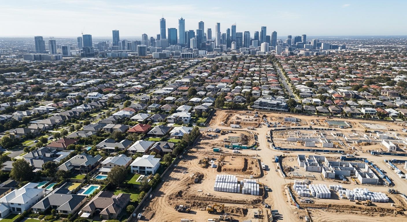
High Population Growth, High Supply: The Growth Corridor Trap
Consider suburbs in Melbourne's outer west or Brisbane's northern corridor. Many of these areas are experiencing genuine population booms as young families seek affordable housing. But they're also home to some of Australia's most active development pipelines. Master-planned communities are releasing new lots and builds at scale, which means the population growth — while real — is being directly matched or exceeded by new construction.
In these areas, you'll often see relatively flat median prices over extended periods despite strong population growth. The median price might even be distorted downward as new, smaller dwellings enter the sales mix. This doesn't mean these suburbs are poor investments — it means population growth alone isn't doing the analytical work investors think it is.
Moderate Population Growth, Constrained Supply: The Hidden Opportunity
Some of Australia's strongest-performing suburbs over the past decade have had moderate, not spectacular, population growth. What set them apart was geographic or regulatory constraints on new supply. Suburbs hemmed in by water, national parks, established infrastructure, or restrictive council zoning can't easily expand their housing stock even when demand increases.
A suburb like Kirwan in Townsville, for example, is largely built out — there's limited land for new development. When population grows in its LGA, much of that demand flows into existing stock rather than being absorbed by new builds. This dynamic is one reason established suburbs with high owner-occupier ratios tend to show stronger price resilience.
Low Population Growth, Low Supply: The Stable Middle
Not every suburb needs to be a growth story. Many established suburban areas across Sydney, Melbourne, and Perth experience relatively low population growth but also very limited new supply. These suburbs tend to deliver steady, inflation-tracking returns rather than dramatic swings in either direction. For investors prioritising stability and consistent rental income over capital growth, understanding that the supply-demand balance is neutral can be just as valuable as identifying a high-growth hotspot.
How to Use This in Your Research
When evaluating a suburb, the population-supply balance should be one of several metrics you consider alongside cashflow calculations, vacancy rates, and yield data. Here's a practical framework:
- Start with the LGA view. Population projections are most reliable at the LGA level. Check whether the broader region is growing, stable, or declining. Picki's LGA pages show population vs supply charts that make this comparison visual.
- Drill into suburb-level supply. Within a growing LGA, some suburbs will have constrained supply while others are in active development zones. Look at recent dwelling approvals at the suburb level to understand where new stock is concentrated.
- Cross-reference with vacancy rates. A suburb with a growing population-supply gap should, in theory, show tightening vacancy rates over time. If vacancy is rising despite a theoretical supply deficit, something else is happening — perhaps the population growth is being overstated, or new supply from adjacent suburbs is absorbing overflow demand.
- Check the dwelling type mix. Not all supply is equal. A suburb adding 500 apartments is very different from one adding 500 houses. The type of supply matters for your investment strategy — if you're buying houses in a suburb where apartments are flooding the market, the supply dynamics for your specific asset class might be more favourable than the headline numbers suggest.
Common Mistakes Investors Make
Mistake 1: Treating Population Growth as a Standalone Metric
This is the most common error. Population growth is a demand-side indicator only. Without supply context, it tells you almost nothing about likely property outcomes. Always pair it with supply data.
Mistake 2: Ignoring the Time Lag
Building approvals don't instantly become completed dwellings. There's typically an 18-24 month lag between approval and completion for houses, and 2-4 years for apartment projects. This means today's supply pipeline might not affect vacancy rates and prices until 2028 or later. Smart investors look at both current supply levels and the pipeline of approvals yet to be completed.
Mistake 3: Assuming All Growth Is Equal
Population growth driven by young professionals migrating for employment has different property market implications than growth driven by retirees downsizing. The former tends to increase rental demand; the latter often increases owner-occupier purchasing. Understanding the demographic composition of growth — not just the headline number — matters for investment strategy. This is where metrics like depreciation potential and dwelling age become relevant alongside population data.
Mistake 4: Overlooking Adjacent Suburb Spillover
Property markets don't stop at suburb boundaries. A suburb might have zero new supply within its borders, but if the neighbouring suburb has a massive development releasing 2,000 new dwellings, some of that supply will compete for the same tenant and buyer pool. Always look at supply dynamics across the broader precinct, not just the individual suburb.
The Bigger Picture: Supply Constraints as a Long-Term Thesis
Australia's national housing supply challenge is well-documented. The federal government's target of 1.2 million new homes by 2029 is widely considered ambitious given current construction sector constraints — labour shortages, rising material costs, and planning approval backlogs. In March 2026, quarterly dwelling approvals remain well below the rate needed to hit that target.
This structural undersupply creates a macro tailwind for property investors, but the benefits aren't evenly distributed. They concentrate in areas where local supply constraints compound the national shortage. Suburbs in established, infill locations with limited development sites stand to benefit most from this dynamic. Growth corridor suburbs with abundant greenfield land, by contrast, may see enough new supply to offset even strong demand.
Understanding where your target suburb sits on this spectrum — and Picki's population-minus-supply metric is designed to help you do exactly that — is one of the most valuable analytical steps you can take before committing capital.
Frequently Asked Questions
What is the population-minus-supply gap in property investing?
The population-minus-supply gap compares projected population growth against recent dwelling approval and completion rates for a given area. When population growth exceeds new housing supply, it creates a supply deficit that typically leads to increased competition for existing properties, tighter vacancy rates, and upward pressure on both rents and property prices. Picki calculates this metric at both the suburb and LGA level using ABS population projections and building approval data.
Why do some high-growth suburbs have flat property prices?
Suburbs can experience strong population growth alongside flat or declining property prices when new housing supply keeps pace with or exceeds incoming demand. This is common in outer-ring growth corridors where large-scale master-planned developments release new stock at scale. The population growth is real, but it's being directly accommodated by new builds rather than competing for existing housing stock.
How far ahead do population projections look?
Picki uses three-year population growth forecasts based on ABS medium-series projections. These projections account for expected fertility, mortality, and internal and overseas migration patterns. While no projection is perfectly accurate, the three-year horizon balances usefulness with reasonable reliability. Longer-term projections (10-20 years) exist but carry significantly more uncertainty.
Should I avoid suburbs with high new supply?
Not necessarily. High supply can indicate strong market confidence and economic development. The key question is whether supply is proportionate to demand growth. A suburb with high supply AND high population growth might maintain a healthy balance. It's the ratio that matters, not the absolute numbers. Additionally, new supply in one dwelling type (e.g., apartments) may not directly compete with another type (e.g., houses) you're considering investing in.
Where can I find population and supply data for Australian suburbs?
Picki provides population growth percentiles and supply data for every suburb and LGA in Australia, comparing each area against national benchmarks. You can explore this data on individual suburb pages and access detailed analytics with a Picki subscription. The underlying data sources include ABS population projections, building approval statistics, and census dwelling counts.
