
How Picki's Market Cycle Indicator Works: Reading Where a Suburb Sits in the Property Cycle
How Picki's Market Cycle Indicator Works: Reading Where a Suburb Sits in the Property Cycle
Every property market moves in cycles. The challenge for investors isn't knowing that cycles exist — it's figuring out where a specific suburb sits right now, and what that means for the next 12 to 36 months. Picki's Market Cycle indicator was built to answer exactly that question, combining six real-time data signals into a single, actionable phase label for every suburb in Australia.
Why Property Cycles Matter for Investment Decisions
Property markets don't move in straight lines. A suburb that delivered 8% capital growth last year might flatten or correct this year. Another suburb that's been quiet for three years might be about to enter a period of sustained growth. The difference between buying at the right moment and buying at the wrong one can represent tens of thousands of dollars in equity over a five-year hold.
The problem is that most investors rely on backward-looking data. They see that Kirwan in Townsville has posted strong recent growth and assume the trend will continue. Or they see a suburb in decline and write it off entirely, missing the early signals that a recovery is forming. According to Picki's analysis, the relationship between current market conditions and future price direction is strongest when multiple indicators align — which is precisely what the Market Cycle indicator measures.
Traditional approaches to timing the market involve monitoring a single metric, like median price changes or auction clearance rates. But no single metric tells the full story. A suburb can show rising prices while vacancy rates climb and vendor discounting increases — early warning signs that the growth phase is maturing. That's why Picki built a composite indicator that reads multiple signals simultaneously.
The Four Market Cycle Phases
Every suburb on Picki is assigned one of four cycle phases, each representing a distinct stage in the market's trajectory. Understanding these phases is critical for aligning your investment strategy with current conditions.
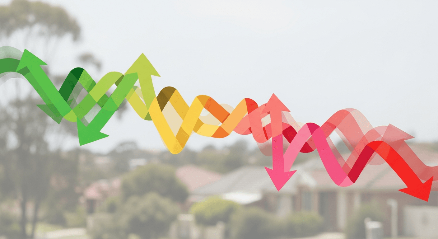
1. Buying Window (Green)
The Buying Window phase signals strong investment potential, with conditions suggesting prices are likely to outperform the broader market average over the next one to three years. Key indicators point to favourable conditions for capital growth: low days of supply, tightening vacancy rates, minimal vendor discounting, and either stable or rising owner-occupier demand.
This is the phase where data-driven investors pay the most attention. Properties in Buying Window suburbs tend to offer the best risk-adjusted entry points because the market fundamentals are aligning before the broader market recognises the opportunity. As of April 2026, Picki data shows that suburbs entering the Buying Window phase typically exhibit vacancy rates below 2% and days of supply under 40 — indicators of genuine demand pressure.
2. Upswing (Amber)
The Upswing phase indicates that prices are rising and capital growth momentum is positive. While the earliest buying opportunity may have passed, the market continues to show strength across most indicators. Investors entering during an Upswing phase can still capture meaningful growth, though the margin of safety is narrower than during a Buying Window.
Suburbs in the Upswing phase often show strong recent price growth combined with sustained low vacancy rates. The key distinction from the Buying Window is that the price signal has already turned positive — meaning you're buying into confirmed momentum rather than anticipating it. This suits investors who prefer to see evidence of growth before committing, accepting a higher entry price in exchange for reduced uncertainty.
3. Consolidating (Pink)
The Consolidating phase signals that prices may grow below the market average in the short term. Rental growth could also slow during this phase. This doesn't necessarily mean a suburb is a poor long-term investment, but it suggests the immediate growth momentum has weakened and a period of sideways or below-trend price movement is likely.
For investors focused on capital growth rather than cash flow, the Consolidating phase is typically a signal to monitor rather than act. The metrics that push a suburb into this phase — rising days of supply, increasing vendor discounting, or softening rental demand — can persist for 12 to 24 months before conditions improve. However, for cash flow investors targeting high rental yields, a Consolidating suburb with stable vacancy rates may still present opportunity.
4. Peak (Red)
The Peak phase indicates that price growth is expected to slow significantly. Capital growth forecasts suggest this may not be the optimal time to invest in the suburb, and investors should consider waiting for conditions to shift. A suburb at Peak shows indicators that are at or past their cyclical highs — typically meaning prices have run hard, vendor discounting is minimal (but about to increase), and days on market are beginning to tick up.
The Peak phase is the most cautionary signal in the Market Cycle indicator. It doesn't predict a crash — property markets rarely crash in the way equities do — but it does signal that the easy gains have been captured and the probability of near-term outperformance is low. Investors who buy at Peak often find themselves holding through a period of flat or negative real returns before the next cycle begins.
The Six Metrics Behind the Indicator
Picki's Market Cycle indicator isn't built on opinion or forecasts. It aggregates six quantitative metrics, each scored and weighted to determine which phase a suburb currently occupies. Here's what feeds into the calculation:
Days of Supply
This measures how long it would take to sell all currently listed properties at the current rate of sales. Low days of supply (under 40 days in most markets) indicates strong demand relative to available stock — a classic precursor to price growth. High days of supply (above 180 days) suggests an oversupplied market where buyers have leverage. This metric is one of the strongest leading indicators in the model, as supply constraints typically precede price movements by three to six months.
Recent Price Growth (Sold Delta)
This tracks the pace and direction of recent sale prices relative to historical averages. Strong recent price growth pushes a suburb toward Upswing or Peak, while slow or negative growth is characteristic of Consolidating or early Buying Window phases. Picki uses actual sold data rather than listing prices, avoiding the bias introduced by vendor asking prices.
Rental Yield
Rental yield reflects the income return relative to property values. High yields can indicate either strong rental demand or suppressed property prices — and the Market Cycle indicator interprets this in context with other metrics. A suburb showing high yields alongside low vacancy rates and low days of supply is fundamentally different from one showing high yields because prices have fallen. Picki's model distinguishes between these scenarios by reading yield alongside the other five signals.
Vacancy Rate
The vacancy rate measures the percentage of rental properties currently unoccupied. As of April 2026, the national average vacancy rate sits around 1.3%, but this varies dramatically by suburb. Suburbs with vacancy rates below 1% are experiencing acute rental supply shortages, which typically supports both rental growth and price growth. Suburbs above 3% may face downward pressure on rents, which eventually flows through to property values.
Vendor Discounting
Vendor discounting measures the gap between initial asking prices and final sale prices. In strong markets, properties sell at or above asking price, resulting in minimal or negative discounting. In softening markets, vendors are forced to reduce their expectations, with discounting of 5% or more signalling a market where supply exceeds demand. This metric is particularly useful as a real-time sentiment gauge — it reveals how the balance of power between buyers and sellers is shifting before that shift shows up in median price data.
Owner-Occupier Levels
The owner-occupier ratio measures the proportion of properties in a suburb occupied by their owners versus rented out. Higher owner-occupier levels generally correlate with price stability and stronger capital growth, as owner-occupiers are less likely to sell during market softness than investors. A suburb with high and rising owner-occupier levels is typically more resilient through market downturns.
How the Phases Flow: A Typical Market Cycle
While every suburb's journey through the cycle is unique, the typical progression follows a predictable pattern. Understanding this flow helps investors contextualise where a suburb sits and what's likely to come next.
A suburb in the Buying Window is showing early signs of demand recovery: vacancy rates are tightening, days of supply are falling, and vendor discounting is reducing. Prices haven't yet responded — this is the gap between leading indicators and lagging price data that creates opportunity.
As those conditions persist, prices begin to rise, and the suburb moves into Upswing. This is the phase where growth becomes visible in the data and media coverage often follows. More buyers enter the market, further reducing supply and accelerating price momentum.
Eventually, the growth rate peaks and the suburb enters Peak. Days of supply begin to creep up, vendor discounting starts to appear, and while prices may still be rising, the rate of increase is slowing. Smart money starts looking elsewhere.
Following Peak, the suburb enters Consolidation. Prices flatten or dip slightly, vacancy rates may soften, and the market enters a period of adjustment. This phase can last anywhere from 12 months to several years, depending on the broader economic environment and local supply dynamics.
And then, as conditions bottom out and new demand signals emerge, the cycle begins again with a fresh Buying Window.
Practical Applications: Using the Market Cycle in Your Research
The Market Cycle indicator is most powerful when used alongside Picki's other suburb-level metrics rather than in isolation. Here's how experienced investors apply it:
Filtering your suburb shortlist: When comparing multiple suburbs across regions — say, weighing up Blacktown in Western Sydney against Point Cook in Melbourne's west — the Market Cycle provides an immediate sense of timing. Two suburbs might score similarly on fundamentals, but if one is in a Buying Window and the other is Consolidating, that distinction matters.
Validating your own research: If you've identified a suburb through your own analysis and the Market Cycle agrees — confirming it's in a Buying Window or early Upswing — that's an additional signal of alignment. If it disagrees, it's worth understanding why. Perhaps your analysis is based on a forward-looking catalyst (like a new infrastructure project) that hasn't yet shown up in the current metrics.
Avoiding emotional decisions: The Market Cycle removes some of the emotional bias from investment decisions. When a suburb is generating headlines about record prices, the indicator might show it's at Peak — a data-driven counterweight to the fear of missing out.
What the Market Cycle Doesn't Tell You
No indicator is perfect, and the Market Cycle has important limitations that investors should understand:
It's not a price prediction. The indicator shows where momentum is pointing based on current conditions. It cannot predict external shocks — interest rate changes, policy shifts, or economic disruptions — that might override the current trajectory.
It operates at the suburb level. Within any suburb, individual streets and property types can perform very differently. A suburb in a Buying Window doesn't mean every property there is a good buy. You still need to assess the specific property's rental income potential, configuration, and street-level dynamics.
Cycle length varies enormously. A Buying Window might last six months in a high-demand capital city suburb or two years in a regional market. The indicator shows the current phase but doesn't predict how long it will persist.
Data currency matters. The indicator is only as current as the underlying data. In thinly traded markets with few sales per quarter, the signals can be noisier and less reliable than in high-volume markets.
How Picki's Market Cycle Compares to Other Timing Approaches
Most property cycle tools in the Australian market rely on a single methodology — typically either price momentum models or supply-demand ratios. Picki's approach is distinctive because it fuses six independent signals rather than relying on any one metric. This multi-signal approach reduces the risk of false signals that plague single-metric models.
For example, a suburb might show rising prices (suggesting Upswing) while vacancy rates are climbing and vendor discounting is increasing. A price-only model would call this an Upswing. Picki's composite model would recognise the conflicting signals and more likely classify it as approaching Peak — a more nuanced and ultimately more useful reading for investors.
The City of Wyndham LGA page provides a good example of how Market Cycle phases vary across suburbs within a single local government area, demonstrating that even neighbouring suburbs can sit at different points in the cycle.
Getting Started with the Market Cycle Indicator
The Market Cycle indicator is visible on every suburb page within Picki's platform. For investors serious about timing their entry into a market, the recommended approach is to:
The Market Cycle indicator is available to all Picki subscribers. View pricing and plans to access the full suite of suburb-level investment tools.
Frequently Asked Questions
How often does Picki update the Market Cycle indicator?
The Market Cycle indicator updates as new data flows into Picki's platform, typically reflecting changes on a monthly basis as fresh sales data, vacancy rates, and listing statistics are processed. Significant shifts in underlying metrics can trigger a phase change at any data refresh point.
Can a suburb skip phases in the cycle?
Yes. While the typical progression is Buying Window → Upswing → Peak → Consolidating, external shocks (such as a sudden interest rate change or major infrastructure announcement) can cause a suburb to jump phases. A suburb in Consolidation might skip directly to a Buying Window if a major demand catalyst emerges, or an Upswing suburb might move to Consolidation if lending conditions tighten rapidly.
Is a Buying Window suburb always a good investment?
Not necessarily. The Buying Window indicates favourable market timing conditions, but it doesn't assess the quality of individual properties, the suitability of the suburb for your specific strategy, or your personal financial situation. A suburb in a Buying Window with weak employment diversity or high flood risk may not suit your risk profile. Always use the Market Cycle alongside Picki's other metrics for a complete picture.
How does the Market Cycle differ from Picki's R-Score?
The R-Score is a comprehensive suburb rating that combines multiple factors including growth potential, yield, demand, and risk. The Market Cycle specifically addresses timing — where the suburb sits in its current price trajectory. A suburb can have a high R-Score (strong fundamentals) but be in a Peak phase (poor timing), or a moderate R-Score but be in a Buying Window (good timing). Ideally, investors look for alignment between a strong R-Score and a favourable cycle phase.
Does the Market Cycle work differently for houses versus units?
Picki's Market Cycle is calculated at the suburb level using aggregate data across dwelling types. In some suburbs, the house market and unit market can be at different cycle phases due to varying supply conditions and demand profiles. Investors should consider the specific dwelling type data available on each suburb page alongside the overall Market Cycle reading.
