

How Picki's Risk Metrics Work: Understanding What Makes a Suburb Higher or Lower Risk for Property Investment
Every property investor talks about returns — capital growth projections, rental yields, cashflow estimates. But fewer investors spend enough time thinking about risk. And risk is where fortunes are protected or lost.
Understanding what makes one suburb a relatively safer investment than another isn't about avoiding risk entirely (that's impossible in property). It's about understanding where your risk sits, how much of it you're taking on, and whether you're being compensated for it through higher potential returns.
Key Takeaways
- Property investment risk is suburb-specific — national averages hide enormous variation at the local level
- Picki evaluates risk across multiple dimensions including vacancy trends, employment concentration, price volatility, and new supply pipelines
- A suburb with high vacancy rates, dependence on a single employer, and volatile price history carries fundamentally different risk than one with tight rental markets and diversified employment
- Risk isn't inherently bad — higher-risk suburbs often offer higher yields as compensation, but you need to understand the trade-off
- As of April 2026, Australian suburbs show widening risk divergence, with some regional centres showing elevated risk signals while established metro corridors remain relatively stable
Why Suburb-Level Risk Assessment Matters More Than Ever
In April 2026, the Australian property market is showing something unusual: a significant divergence between markets. While some capital city corridors continue to see steady demand and price stability, other areas — particularly some regional centres and outer-growth suburbs — are showing early stress signals.
This divergence means that national-level commentary about "the property market" is increasingly unhelpful. What matters is what's happening in your specific suburb, and that's where data-driven risk assessment becomes essential.
According to Picki's analysis, the spread between the lowest-risk and highest-risk suburbs in Australia has widened by approximately 15% over the past 12 months. Suburbs that were marginally risky in 2025 have, in some cases, tipped into genuinely elevated risk territory in 2026.
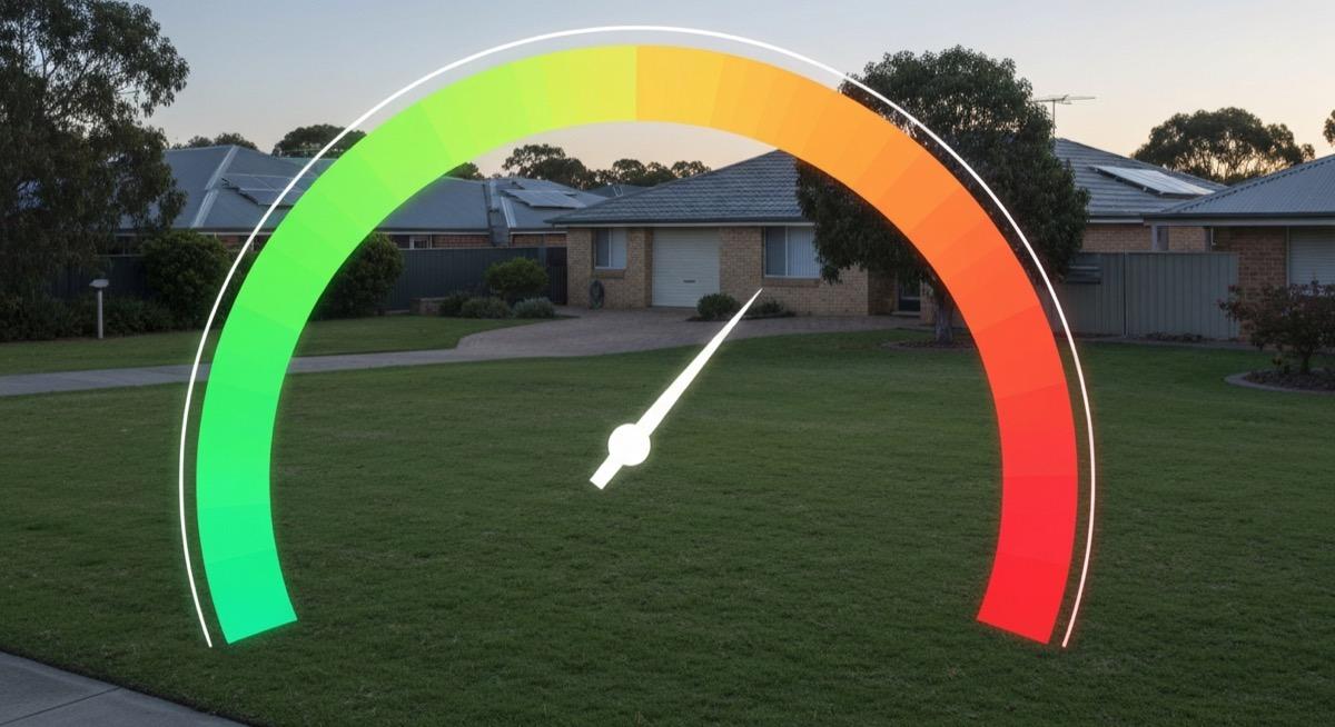
The Five Pillars of Suburb-Level Investment Risk
When Picki evaluates a suburb's risk profile, it draws on multiple independent data streams. No single metric tells the full story — it's the combination of signals that reveals whether a suburb's risk profile is manageable, elevated, or concerning.
1. Vacancy Rate Trends (Not Just the Snapshot)
Most investors check the current vacancy rate for a suburb. That's a start, but it misses the crucial dimension: direction.
A suburb with a 2.5% vacancy rate that was at 1.8% six months ago is telling a very different story from one sitting at 2.5% that was at 3.5% six months ago. The first is loosening; the second is tightening. Same number, opposite risk trajectories.
Picki tracks vacancy rate trends over rolling 6-month and 12-month windows to identify whether a suburb's rental market is strengthening or weakening. A vacancy rate that's been rising for three consecutive quarters is a warning signal, particularly if it's accompanied by increasing days on market for rental listings.
For context, the national residential vacancy rate in March 2026 sits at approximately 1.4%, but individual suburbs range from effectively 0% in some regional Queensland centres like Kirwan to over 5% in parts of inner-city Melbourne's apartment market.
2. Employment Concentration and Economic Diversity
One of the most underappreciated risk factors in property investment is employment concentration. A suburb — or more accurately, the local government area it sits within — that depends heavily on a single employer or industry carries structural risk that no amount of rental yield can fully compensate for.
We've explored this concept in detail in our piece on employment diversity and economic resilience, but in risk terms, the key insight is straightforward: if 40% of local jobs depend on one mine, one hospital, or one military base, the suburb's property market is essentially a leveraged bet on that employer's future.
Picki measures employment diversity using a Herfindahl-style concentration index across industry categories within each LGA. Suburbs within LGAs that score poorly on this metric carry higher structural risk, regardless of how strong their current rental market appears.
Consider the difference between a suburb in the City of Wyndham, which has diversified employment across retail, healthcare, education, construction, and logistics — versus a mining-dependent regional town. Both might show strong vacancy rates today, but their risk profiles under economic stress are fundamentally different.
3. Price Volatility and Historical Drawdowns
Past price behaviour doesn't predict future returns, but it does reveal how a suburb responds to economic stress. Suburbs that experienced sharp price corrections during previous downturns (2008, 2011, 2017–2019, 2022) tend to show similar patterns in subsequent cycles.
Picki analyses historical price volatility using the standard deviation of quarterly price movements over rolling five-year and ten-year windows. Suburbs with higher volatility have delivered wider ranges of outcomes — bigger upswings but also deeper drawdowns.
This connects directly to your investment timeline. If you're holding for 15+ years, volatility matters less. If you might need to sell within 5 years, buying into a high-volatility suburb means accepting the real possibility of selling at a loss, regardless of long-term fundamentals.
As we discussed in our analysis of why median price can mislead investors, headline median figures often smooth over significant price dispersion within a suburb. A suburb where the median rose 5% might contain streets where values dropped 10% and others where they rose 15%. This internal variation is itself a risk factor.
4. Supply Pipeline and Development Approvals
New supply is one of the most predictable risk factors in property — and one of the most commonly ignored by investors focused on demand-side metrics.
When a suburb has a large pipeline of approved but not-yet-built dwellings relative to its existing stock, there's a quantifiable risk of oversupply dampening both capital growth and rental returns in the medium term.
Picki tracks development approvals data at the suburb and LGA level, calculating the ratio of approved-but-incomplete dwellings to existing stock. A suburb with a 15% pipeline ratio — meaning approved developments would add 15% more dwellings if all completed — carries materially more supply risk than one with a 3% ratio.
This is particularly relevant in growth corridors like Tarneit in Melbourne's west or Point Cook, where large master-planned communities can deliver hundreds of new dwellings annually. The long-term demand story might be strong, but the short-to-medium-term supply glut can suppress returns and increase vacancy rates.
5. Demographic Stability and Population Trends
Suburbs with stable or growing populations face fundamentally different risk profiles from those experiencing population decline. Population loss typically leads to rising vacancies, falling rents, reduced buyer demand, and ultimately price stagnation or decline.
Picki integrates ABS population estimates and migration data to identify suburbs where demographic trends are working for or against property investors. A suburb losing population at 1-2% per year is a red flag that compounds over time, even if current metrics look acceptable.
Conversely, suburbs experiencing strong population growth — particularly through interstate or overseas migration — tend to show tightening rental markets and upward price pressure. Our analysis of how Picki estimates rental income explains how demographic trends feed directly into rental return projections.
How Risk and Return Connect in Practice
Higher risk isn't necessarily bad — it's uncompensated risk that destroys wealth.
A suburb with elevated risk signals (high vacancy trend, concentrated employment, volatile price history) that also offers a gross rental yield of 7-8% may actually represent a reasonable risk-adjusted proposition. The high yield compensates you for the higher probability of capital growth underperformance or vacancy periods.
The danger zone is suburbs that carry elevated risk but don't offer correspondingly higher yields. This sometimes occurs in suburbs that experienced a recent speculative run-up — prices rose on momentum rather than fundamentals, pushing yields down while risk remained high or increased.
Picki's approach to gross versus net yield analysis helps quantify this risk-return relationship. When a suburb's net yield after holding costs doesn't adequately compensate for its risk profile, the data suggests looking elsewhere.
Practical Examples: High Risk vs Low Risk Suburbs in 2026
Without naming specific scores (which are available on the Picki platform), here's how risk profiles differ across suburb types in April 2026:
Lower-risk profile characteristics:
- Vacancy rate below 1.5% and stable or declining over 12 months
- Employment diversified across 5+ major industry categories
- Historical price drawdowns of less than 8% during the 2022 correction
- Supply pipeline below 5% of existing stock
- Population growing at 1%+ annually
Higher-risk profile characteristics:
- Vacancy rate above 3% or rising for 2+ consecutive quarters
- Employment concentrated in 1-2 industries (mining, defence, tourism)
- Historical price drawdowns exceeding 15% during previous corrections
- Supply pipeline above 10% of existing stock
- Population flat or declining
Suburbs like Blacktown in Sydney's west tend to sit in the lower-to-moderate risk range due to diversified employment, strong transport infrastructure, and consistent population growth. By contrast, some single-industry regional towns — while offering attractive headline yields — carry risk profiles that many investors underestimate.
Using Risk Data in Your Investment Decision
Risk assessment shouldn't be the only factor in your investment decision, but it should be a non-negotiable part of your due diligence. Here's how to integrate it:
- Start with your risk tolerance. Are you a conservative investor seeking stable, predictable returns? Or are you comfortable with higher volatility in exchange for potentially higher yields? Your answer should filter your suburb shortlist before you look at anything else.
- Compare risk-adjusted returns, not raw returns. A suburb offering 5% yield with low risk may be genuinely superior to one offering 7% yield with high risk, depending on your circumstances and hold period.
- Watch for risk changes over time. A suburb's risk profile isn't static. Picki's data updates as new vacancy, employment, supply, and price data comes in. A suburb that was low-risk 12 months ago may have shifted if a major employer downsized or if a large development approval came through.
- Diversify across risk profiles. If you're building a portfolio that balances growth and cashflow, consider mixing lower-risk, lower-yield properties with higher-risk, higher-yield ones to manage overall portfolio risk.
Frequently Asked Questions
What makes a suburb "high risk" for property investment?
A suburb is considered higher risk when multiple data signals align negatively: rising vacancy rates, dependence on a single industry for employment, a history of sharp price corrections during economic downturns, a large pipeline of new development approvals, and flat or declining population. No single factor makes a suburb high risk — it's the combination that matters. Picki data shows that suburbs with three or more elevated risk indicators have historically underperformed on a risk-adjusted basis over 5-year holding periods.
Does higher risk always mean higher returns in property?
No. While financial theory suggests risk and return should correlate, property markets are inefficient enough that many high-risk suburbs do not offer adequate yield compensation. The most dangerous investments are those where risk is high but yields have been compressed by speculative price increases. Data-driven analysis of risk-return relationships at the suburb level helps identify which high-yield markets genuinely compensate for their risk and which don't.
How often do suburb risk profiles change?
Suburb risk profiles can shift meaningfully within 6-12 months. A major employer closure, a large development approval, a sudden population inflow or outflow, or a sharp vacancy rate movement can all alter a suburb's risk assessment. This is why point-in-time due diligence isn't sufficient — ongoing monitoring of risk metrics is essential for active property investors.
Should first-time investors avoid high-risk suburbs entirely?
Not necessarily, but first-time investors with limited capital reserves are generally better served by lower-risk suburbs. High-risk suburbs can deliver strong returns, but they require greater financial resilience to weather potential vacancy periods, maintenance issues, or temporary price declines. If a vacant property or unexpected repair bill would cause genuine financial stress, a more conservative suburb selection reduces that probability. Explore our guide to cashflow calculations to understand the financial buffer you'd need.
How does Picki's risk assessment differ from other property data platforms?
Most property data platforms present individual metrics — a vacancy rate here, a median price there — leaving investors to synthesise them independently. Picki combines multiple risk dimensions into a holistic suburb-level assessment that weights each factor based on its historical predictive value. This multi-dimensional approach captures risk that single-metric analysis misses, such as the interaction between rising supply and weakening employment diversity.
Ready to see how your target suburbs compare on risk? Explore Picki's suburb data to access vacancy trends, employment diversity scores, supply pipeline indicators, and more — all in one place.