

How to Compare Suburbs Side by Side: Using Data to Shortlist Your Best Property Investment Options
Choosing between two or three suburbs that all look promising on paper is one of the hardest parts of property investing. You've done your initial research, you've got a shortlist, but how do you actually decide which suburb offers the best fit for your strategy, budget, and risk tolerance?
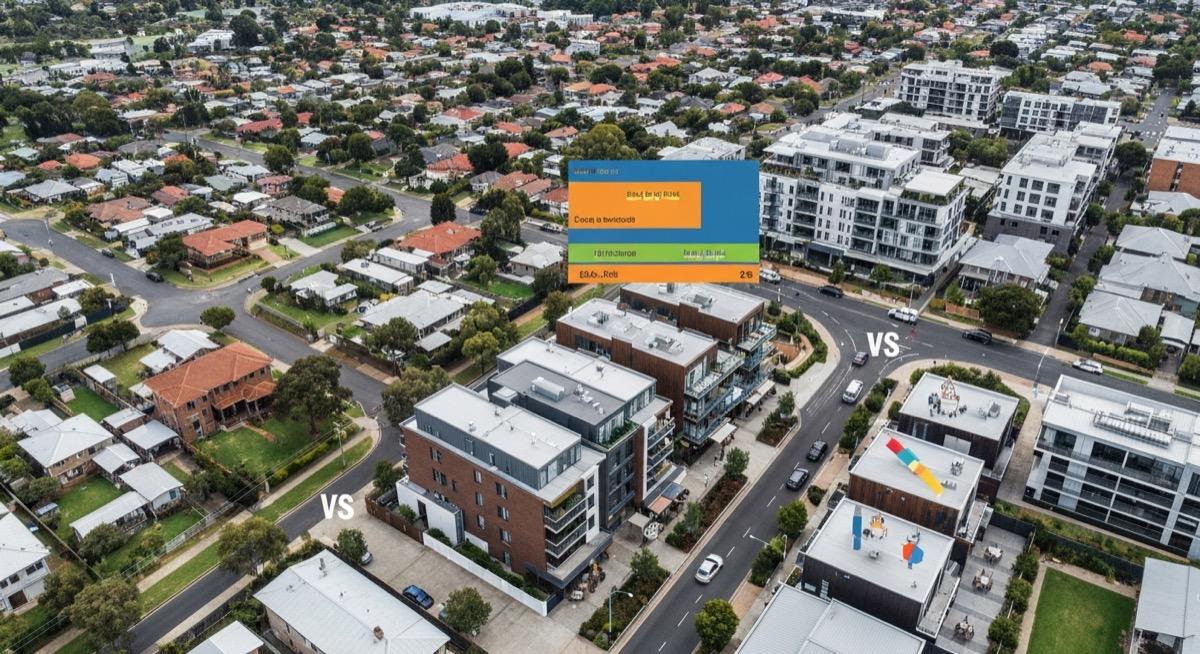
The answer isn't gut feel — it's structured comparison. By lining up the right data points side by side, you can cut through the noise and make investment decisions with genuine confidence.
Why Most Suburb Comparisons Fall Short
The typical property investor compares suburbs by pulling up median prices, maybe checking recent sales, and getting a feel for the area. This approach has three fundamental problems.
First, it's incomplete. Median prices tell you what properties cost — they don't tell you whether the market is strengthening, weakening, or about to shift. As we've explored in our analysis of why medians can mislead investors, a single number can mask enormous variation within a suburb.
Second, it's inconsistent. When you compare suburbs at different times, using different sources, you're not really comparing like with like. Data freshness, methodology, and coverage all vary between providers.
Third, it's unweighted. Not every metric matters equally for every investor. A retiree seeking stable rental income needs to weight different factors than a high-income earner chasing capital growth with negative gearing.
The 10 Data Points That Actually Matter for Suburb Comparison
After analysing thousands of Australian suburbs, these are the metrics that consistently separate strong investment suburbs from weak ones. The key is looking at all of them together, not cherry-picking the ones that confirm what you already believe.
1. Median Price and Price Dispersion
Start with median price to establish your budget fit, but immediately look at price dispersion — the range between the 25th and 75th percentile sales. A suburb with a median of $550,000 and tight dispersion ($480,000–$620,000) is a very different proposition from one with the same median but prices ranging from $350,000 to $850,000. Wide dispersion means your experience depends heavily on which specific property you buy.
2. Rental Yield (Gross and Net)
Compare both gross and net yields side by side. Two suburbs might show identical gross yields of 5.2%, but once you factor in council rates, insurance, property management fees, and maintenance costs, the net yields can diverge significantly. Suburbs with older housing stock, for instance, typically carry higher maintenance costs that eat into net returns.
3. Days on Market
This is your demand thermometer. When comparing suburbs, the one with consistently lower days on market is typically experiencing stronger buyer demand. But context matters — a suburb averaging 25 days on market in a region where 40 is normal is outperforming its peers. According to Picki's analysis, suburbs where days on market has been trending downward over three consecutive quarters tend to show price strengthening in the following 12 months.
4. Vacancy Rate
Compare vacancy rates to understand rental market tightness. A vacancy rate below 2% suggests landlords have pricing power and tenant demand is robust. But also compare the trend direction — a suburb with 1.8% vacancy that's been rising for six months tells a different story from one at 2.5% that's been falling.
5. Population Growth Rate
Population growth drives housing demand. When comparing suburbs, look at the annualised growth rate over the most recent five-year period. Suburbs in areas like Tarneit VIC that have experienced strong population influx tend to show sustained demand across both purchase and rental markets. But population growth alone isn't enough — you need to check whether new housing supply is keeping pace.
6. Supply Pipeline (New Builds and Development Applications)
This is where many investors get caught. A suburb showing strong demand metrics might have a massive development pipeline that will flood the market with new stock in 18–24 months. Compare the ratio of approved new dwellings to existing housing stock. Suburbs where new supply represents more than 3–4% of existing stock per year warrant closer scrutiny.
7. Owner-Occupier Ratio
The owner-occupier ratio reveals the suburb's fundamental character. Areas with 65–75% owner-occupiers tend to show more price stability and community investment. Suburbs heavily skewed toward investors (below 55% owner-occupier) can be more volatile and more sensitive to interest rate changes and regulatory shifts.
8. Employment Diversity
Suburbs reliant on a single industry or employer carry concentration risk. Compare the employment diversity index across your shortlisted suburbs. Areas like Blacktown NSW, which benefit from diverse employment across healthcare, logistics, retail, and government, tend to weather economic downturns better than single-industry towns.
9. Infrastructure Investment
Compare planned and in-progress infrastructure projects near each suburb. Transport links, hospital upgrades, school expansions, and commercial precincts all signal government confidence in an area's growth trajectory. Picki data shows that suburbs within 5km of major infrastructure projects announced in the last 24 months tend to outperform surrounding areas.
10. Vendor Discount Patterns
The gap between listing price and sale price reveals market dynamics. In a suburb where properties consistently sell at or above asking price, buyers are competing. In one where 10–15% discounts are common, sellers are struggling. Compare these patterns across your shortlist to gauge relative market strength.
Building Your Comparison Framework
The real power of suburb comparison comes from structuring your analysis rather than jumping between data points randomly. Here's a practical framework that works for most investors.
Step 1: Define Your Strategy Weights
Before comparing anything, decide what matters most for your specific situation. If you're pursuing capital growth, weight population growth, infrastructure investment, and days on market more heavily. If cash flow is your priority, emphasise rental yield, vacancy rates, and tenant demand indicators.
A balanced strategy should weight all metrics roughly equally, with perhaps a slight tilt toward your secondary preference.
Step 2: Normalise Your Data
Raw numbers don't compare well. A vacancy rate of 1.2% and a population growth rate of 2.8% are both positive signals, but they're on different scales. Convert each metric to a relative score — is this suburb in the top 10%, top 25%, or bottom half for this metric compared to similar suburbs?
This is exactly what Picki's scoring system does: it normalises dozens of data points into comparable scores so you can see at a glance how suburbs stack up against each other.
Step 3: Run Your Comparison Table
Create a simple table with your shortlisted suburbs as columns and your weighted metrics as rows. Highlight the leader in each metric. The suburb that leads across the most categories — weighted by your strategy priorities — is your strongest candidate.
For example, comparing Kirwan QLD against Mandurah WA and Point Cook VIC reveals very different investment profiles despite all three being popular with investors. Kirwan offers stronger yields in a tight rental market, Point Cook delivers growth corridor upside with newer housing stock, and Mandurah provides lifestyle appeal with improving infrastructure.
Step 4: Apply Risk Filters
Once you have a shortlist leader, stress-test it. What happens if interest rates rise another 50 basis points? What if the dominant local employer downsizes? What if the infrastructure project gets delayed? The suburb that still looks reasonable under pessimistic assumptions is the more resilient investment.
Common Comparison Mistakes to Avoid
Comparing Different Property Types Across Suburbs
If you're looking at houses in Suburb A and units in Suburb B, you're not really comparing suburbs — you're comparing asset classes. Keep your comparison consistent by looking at the same dwelling type across all suburbs on your shortlist.
Ignoring the LGA Context
Suburbs don't exist in isolation. A suburb that looks strong individually might sit within an LGA that's facing council funding pressures, planning restrictions, or demographic shifts. Always zoom out to understand the broader local government area dynamics.
Recency Bias
The suburb that performed best over the last 12 months isn't necessarily the best investment for the next five years. Property markets are cyclical. Compare performance across multiple time periods — 1-year, 3-year, 5-year, and 10-year — to get a fuller picture.
Overweighting a Single Metric
No single data point makes or breaks a suburb. A 6% gross yield means little if vacancy rates are climbing and population is declining. Always assess the full picture.
When to Revisit Your Comparison
Markets shift. A comparison you ran three months ago may no longer be accurate if vacancy rates have moved, new infrastructure has been announced, or interest rate expectations have changed. As a general rule, refresh your suburb comparison every quarter if you're actively in the market, or at least every six months if you're in planning mode.
Platforms like Picki make this easier by keeping data current and scoring suburbs consistently, so you're always comparing apples with apples rather than manually updating spreadsheets from five different sources.
Putting It Into Practice
The investors who consistently make strong property decisions aren't necessarily smarter — they're more systematic. They've built a comparison framework that suits their strategy, they apply it consistently, and they let the data guide their decisions rather than their emotions.
Start with three suburbs, ten metrics, and your strategy weights. Run the comparison. Then do it again next quarter. Over time, you'll develop an intuitive sense for what strong suburb data looks like — backed by the discipline of structured analysis.
Frequently Asked Questions
How many suburbs should I compare at once?
Three to five suburbs is the sweet spot for meaningful comparison. Fewer than three doesn't give you enough contrast, and more than five makes the analysis unwieldy. Start with a broad filter (budget, state, yield threshold) to narrow to five, then do deep comparison on your top three.
Which single metric is most important when comparing suburbs?
There is no single most important metric — that's exactly why comparison frameworks matter. However, if forced to choose, days on market combined with vacancy rate gives you the clearest demand signal. Strong demand (low days on market, low vacancy) tends to precede price growth and supports rental income simultaneously.
How often should I update my suburb comparison data?
Quarterly is ideal for active investors. Market conditions — particularly vacancy rates, days on market, and listing volumes — can shift meaningfully within a three-month period. Annual comparisons are too infrequent to capture market turning points.
Can I compare suburbs across different states?
Yes, but you need to account for differences in stamp duty, land tax, tenancy legislation, and market cycles. A 5% gross yield in Queensland and a 5% gross yield in Victoria deliver different net outcomes once you factor in state-specific costs. Picki's data normalises many of these factors, but always run your own cashflow calculations for your specific tax situation.
Should I weight recent performance more heavily than long-term trends?
Use both, but for different purposes. Recent performance (last 12 months) tells you about current market momentum. Long-term trends (5–10 years) tell you about the suburb's fundamental trajectory. A suburb with strong long-term growth that's currently experiencing a cyclical dip may represent better value than one that's recently surged from a low base.