
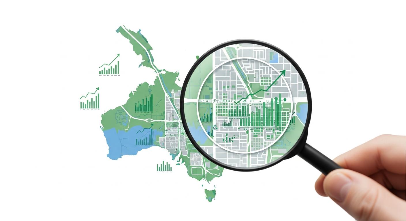
How to Find Undervalued Suburbs in Australia: A Data-Driven Framework for Property Investors in 2026
What Makes a Suburb "Undervalued" — and Can Data Help You Find One?
Every property investor wants to buy into a suburb just before it takes off. The appeal is obvious: purchase at today's price, ride the wave of growth, and build equity faster than the broader market. But the gap between "suburb tipped to boom" media lists and genuinely data-driven suburb identification is enormous — and it's where most investors go wrong.
In 2026, with interest rates stabilising and national housing supply still lagging demand, the Australian property market is entering a phase where suburb selection matters more than it has in years. The days of buying almost anywhere and riding a rising tide are over. The suburbs that outperform from here will be the ones where fundamentals align — and those fundamentals are measurable.
Key Takeaways
- Undervalued suburbs are identified by comparing current prices against fundamental demand indicators, not by gut feel or media tips
- Six key data points — yield compression, supply constraints, population growth, infrastructure spend, vacancy trends, and days on market — form a reliable screening framework
- Australia's structural housing undersupply in 2026 creates opportunity, but it's concentrated in specific suburbs with constrained supply and growing demand
- Picki's suburb scoring system ranks every Australian suburb against these fundamentals to surface areas where the data diverges from current pricing
- Avoid common traps: chasing yield without growth context, or growth without cashflow viability
The Six Data Points That Signal Undervaluation
There's no single metric that tells you a suburb is undervalued. But when multiple indicators align in the same direction, the signal becomes harder to ignore. Here are the six data points sophisticated investors use to screen for opportunity — and how each contributes to the picture.
1. Gross Yield Above the Regional Average
When a suburb's gross rental yield sits meaningfully above its state or regional average, it can indicate one of two things: either the suburb has structural factors that justify higher yields (higher risk, lower demand), or the property prices haven't yet caught up with rental demand growth.
The key is distinguishing between the two. A suburb with above-average yield AND improving fundamentals (falling vacancy, growing population, rising incomes) is more likely to be in the second category — genuinely underpriced relative to its rental income. A suburb with high yield but rising vacancy and declining population may be offering that yield as compensation for risk, not as an opportunity.
In March 2026, the national average gross yield for houses sits around 3.8%, with significant variation between capital cities (often 2.5-3.5%) and regional areas (4.5-7%+). Suburbs yielding 5-6% in metropolitan areas or 7-8% in well-located regional centres deserve closer examination, particularly when other indicators support the story.
2. Constrained New Housing Supply
As discussed in our analysis of Australia's tightest rental markets, supply constraints are one of the most powerful drivers of property value growth. Suburbs where geographic, regulatory, or infrastructure barriers limit new development face a structural advantage: demand can increase, but supply can't easily respond.
According to Picki's analysis, suburbs ranking in the top quartile for supply constraint (low recent dwelling approvals relative to existing stock) have historically shown stronger price resilience during downturns and faster recovery during upswings. This makes supply data one of the most valuable screening filters available to investors.
Look for suburbs where recent dwelling approvals as a percentage of existing housing stock sit below 1% annually. These areas are supply-constrained by definition — any increase in demand flows directly into competition for existing properties rather than being absorbed by new builds.
3. Population Growth Exceeding Supply
Population growth alone doesn't guarantee property price growth — you need to see growth outpacing new supply. The population-minus-supply gap, which Picki tracks at both the suburb and LGA level, identifies areas where incoming demand is exceeding the construction pipeline's ability to respond.
In 2026, the strongest population-supply imbalances are emerging in established suburbs within Australia's major employment corridors. Suburbs within 15-25km of major CBDs, particularly those near hospital precincts, university campuses, and emerging tech hubs, are seeing sustained population pressure without proportionate new housing. This is a direct consequence of the national undersupply — at current construction rates, Australia is tracking approximately 40,000 dwellings per year below the federal government's 1.2 million target.
4. Infrastructure Investment in the Pipeline
Government infrastructure spending is one of the most reliable leading indicators of property market performance. Road upgrades, rail extensions, hospital expansions, and school construction create employment, improve amenity, and attract population growth — often years before the projects complete.
Picki data shows infrastructure investment at the LGA level through its project spend per capita metric. Suburbs within LGAs receiving above-average infrastructure spend per resident tend to outperform over 5-10 year horizons. The effect is strongest in the years between project announcement and completion, when market sentiment shifts but the full amenity benefit hasn't yet been priced in.
In 2026, major infrastructure corridors worth watching include Sydney's Western Metro line (benefiting suburbs in the City of Parramatta), Melbourne's Suburban Rail Loop (affecting suburbs across the eastern and south-eastern corridors), and Brisbane's Cross River Rail (now operational, with flow-on development in adjacent suburbs). Each of these projects is creating measurable uplift in nearby property markets.
5. Vacancy Rate Trends (Not Just Levels)
A low vacancy rate tells you the rental market is tight right now. A falling vacancy rate tells you it's getting tighter — and that's the more valuable signal for investors. Suburbs where vacancy rates are trending downward over 12-24 months are experiencing real-time demand pressure that typically translates into rental growth first, and capital growth second.
As of March 2026, Australia's national rental vacancy rate sits at approximately 1.3% — well below the 3% benchmark generally considered a balanced market. But this national figure masks significant variation. Some suburbs sit at effective zero vacancy (under 0.5%), while others, particularly those with recent apartment oversupply, may sit at 3-4% or higher.
The suburbs with the strongest undervaluation signal are those where vacancy has compressed from, say, 2.5% to 1.0% over two years — a trend suggesting demand is structurally outpacing supply. Pair this with rental income estimates to understand whether the tightening market is translating into actual rent growth.
6. Days on Market Compression
When properties start selling faster in a suburb, it signals increasing buyer competition. Days on market (DOM) is a leading indicator of price growth — when DOM compresses, price increases typically follow within 3-6 months as vendors adjust their expectations upward.
A suburb where average DOM has dropped from 60 days to 30 days over the past year is experiencing a meaningful shift in buyer demand. This is particularly significant when it occurs in a suburb that hasn't yet seen substantial median price movement — it suggests the market is turning before prices fully reflect the change.
Putting It Together: A Screening Framework
No single data point constitutes proof of undervaluation. The power lies in convergence. Here's how to build a practical screening process:
Step 1: Set your baseline filters. Choose your target state or region, property type (house/unit), and budget range. This narrows Australia's 15,000+ suburbs down to a manageable research list.
Step 2: Screen for yield above the regional average. Filter for suburbs delivering at least 1-1.5 percentage points above the state average gross yield. This is your initial "potentially underpriced" filter.
Step 3: Check supply constraints. From your yield-filtered list, identify suburbs with low recent dwelling approvals. Remove suburbs in active growth corridors with large development pipelines unless other signals are exceptionally strong.
Step 4: Verify population and demand trends. Confirm the suburb is in an LGA with positive population growth projections and, ideally, a population-supply gap favouring demand over supply.
Step 5: Look for infrastructure catalysts. Prioritise suburbs near major infrastructure projects in planning or construction phases. These represent embedded future value that the market may not have fully priced.
Step 6: Confirm with vacancy and DOM trends. The final check — are vacancy rates tightening and days on market falling? If yes, the demand story is being confirmed by real market behaviour, not just statistical projections.
Picki's suburb scoring system automates much of this screening process. Each suburb receives a composite score that weights these fundamental indicators, and the platform's suburb comparison tools let you evaluate multiple areas side by side. You can start exploring suburbs that match these criteria on the suburb pages — try comparing areas like Mandurah in Western Australia or Tarneit in Victoria to see how different markets score across these dimensions.
Three Traps to Avoid When Hunting for Undervalued Suburbs
Trap 1: Chasing Yield Without Growth Context
Some of Australia's highest-yielding suburbs are in areas with declining populations, shrinking employment bases, or oversupplied rental markets. A 9% gross yield in a remote mining town might look attractive on a spreadsheet, but if the population has fallen 15% in five years and vacancy is climbing, that yield is compensating for capital risk — not signalling opportunity.
Always verify that yield is supported by positive or stable demand indicators. A 5.5% yield in a suburb with growing population, tight vacancy, and infrastructure investment is far more attractive than a 8% yield in a suburb with deteriorating fundamentals.
Trap 2: Relying on "Hotspot" Lists
Media hotspot lists are designed to generate clicks, not investment returns. They typically highlight suburbs that have already experienced growth (backward-looking) or rely on a single catalyst (too narrow). By the time a suburb appears on a national hotspot list, the smart money has often already moved.
Data-driven screening is fundamentally different from hotspot hunting. It doesn't ask "which suburbs are exciting right now?" It asks "which suburbs have fundamentals that suggest current pricing doesn't fully reflect demand?" That's a much harder question to answer — but a much more valuable one.
Trap 3: Ignoring Cashflow Viability
A suburb can tick every box for capital growth potential, but if the cashflow position is deeply negative, it may not be suitable for your financial situation. Always model the after-tax position including depreciation, interest, and holding costs before committing. The best investment is one you can actually hold long enough for the thesis to play out.
What This Looks Like in 2026
In the current market, several broad patterns are emerging from the data:
Regional cities with diversified economies (not single-industry towns) are showing some of the strongest population-supply imbalances. Suburbs in regional centres like Townsville, Ballarat, Geelong, and the Sunshine Coast are benefiting from remote work migration patterns that accelerated during 2020-2022 and have now become structural rather than cyclical.
Middle-ring metropolitan suburbs (10-25km from CBDs) in Sydney, Melbourne, and Brisbane are showing the tightest supply constraints. These established suburbs can't easily densify due to planning restrictions and community resistance, creating persistent undersupply even as population pressure mounts.
Suburbs near health and education precincts continue to outperform on multiple demand metrics. Hospital expansions and university investments create stable, long-term employment clusters that drive consistent rental demand regardless of broader economic cycles.
The suburbs that score well across all six dimensions in 2026 are scattered across every state — there's no single geographic pattern. That's why data-driven screening is essential. The opportunities aren't where you'd necessarily expect them to be, and they won't be found by reading the same news articles everyone else reads.
Getting Started
The framework outlined above works whether you're screening manually using publicly available data or using tools like Picki that aggregate and rank these metrics automatically. The critical shift is moving from anecdote-based suburb selection ("my mate says Suburb X is going up") to evidence-based screening where every suburb is evaluated against the same objective criteria.
Start by identifying three to five suburbs that score well on at least four of the six dimensions above. Then conduct detailed due diligence on each — inspect properties, talk to local agents, walk the streets, and understand the community. Data can tell you where to look. It can't tell you which specific property to buy. That final step still requires human judgment, local knowledge, and professional advice.
Frequently Asked Questions
How do you identify an undervalued suburb in Australia?
An undervalued suburb is one where current property prices don't fully reflect fundamental demand indicators. Key signals include above-average rental yield with improving demand metrics, constrained new housing supply, population growth exceeding new dwelling approvals, significant infrastructure investment in the pipeline, falling vacancy rates, and compressing days on market. When multiple indicators align, the probability of undervaluation increases. Picki's suburb scoring system evaluates every Australian suburb against these fundamentals.
What gross rental yield indicates a potentially undervalued suburb?
As a general screening threshold, look for suburbs yielding at least 1-1.5 percentage points above their state average gross yield. In March 2026, this means approximately 5%+ for metropolitan suburbs and 6.5%+ for well-located regional suburbs. However, high yield alone is not sufficient — it must be paired with positive demand indicators to distinguish genuine undervaluation from risk compensation.
Is population growth a reliable predictor of property price growth?
Population growth is a necessary but not sufficient condition for property price growth. The critical factor is whether population growth exceeds new housing supply. A suburb with 3% annual population growth and 4% annual dwelling growth is likely oversupplied despite the strong population numbers. The population-minus-supply gap, tracked by Picki at the suburb and LGA level, is a more reliable indicator than population growth alone.
How does infrastructure spending affect property values?
Government infrastructure investment — including transport, health, education, and utility projects — creates employment, improves amenity, and attracts population growth. Property values near infrastructure projects tend to increase most during the planning and construction phases, before the project's benefits are fully priced into the market. Picki tracks project spend per capita at the LGA level to help investors identify areas receiving above-average infrastructure investment.
What tools can I use to screen for undervalued suburbs in Australia?
Picki (explore suburb data here) provides automated suburb scoring based on yield, supply, population growth, infrastructure, vacancy, and market dynamics for every suburb in Australia. The platform ranks each suburb against national benchmarks across these dimensions, helping investors quickly identify areas where fundamentals suggest current pricing may not reflect underlying demand. Free suburb snapshots are available, with detailed analytics accessible via paid subscription.
