
What Supply and Demand Metrics Actually Tell You About a Suburb and How to Read the Signals
Every suburb tells a story through its supply and demand data â but most investors read only half the page. They check median prices, glance at rental yields, and call it research. The real edge comes from understanding the balance between how many properties are available and how many buyers and tenants want them. That balance determines whether prices rise, stagnate, or fall over the coming years.
Supply and demand metrics are the closest thing property investors have to a leading indicator. Unlike median prices, which tell you what already happened, supply and demand signals hint at what is likely to happen next. Learning to read them properly is one of the most valuable skills you can develop as a data-driven investor.
Key Takeaways
- Supply metrics (listings volume, days on market, new construction pipeline) reveal seller pressure and future stock levels
- Demand metrics (population growth, absorption rates, vacancy rates) show buyer and tenant competition
- The ratio between supply and demand â not either metric alone â determines a suburb's price trajectory
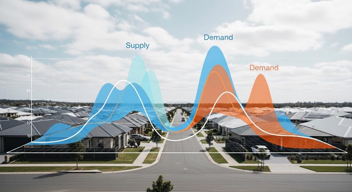
- Picki data shows that suburbs where new supply is being absorbed faster than it is built tend to experience sustained price growth
- Seasonal patterns can distort short-term readings, so always compare year-on-year rather than month-on-month
Why Supply and Demand Matters More Than Price History
Price history is backward-looking. It tells you what buyers paid six months ago, filtered through settlement delays and reporting lags. By the time a median price shift appears in the data, the market conditions that caused it may have already changed.
Supply and demand metrics, on the other hand, capture what is happening right now. A suburb with falling listings and rising population is experiencing tightening conditions â even if the median price has not moved yet. Conversely, a suburb showing strong recent capital growth but rising listings and slowing population growth may be approaching a ceiling.
This is why sophisticated investors look at supply and demand before they look at price. According to Picki's analysis, suburbs where supply-demand dynamics shifted favourably in 2024 saw median price growth of 8-15% through 2025, while suburbs where supply outpaced demand saw flat or negative movement â regardless of how strong their prior five-year growth looked.
The Supply Side: What to Measure and Why
Active Listings Volume
The number of properties currently listed for sale in a suburb is the most direct measure of supply. But the raw number means little without context. A suburb with 45 active listings might be oversupplied if it only has 2,000 dwellings, but perfectly healthy if it has 15,000.
What matters is the listings-to-dwellings ratio and how it compares to the suburb's own historical average. A suburb running 30% above its five-year average listings level is showing seller pressure â owners want out, and buyers have more choice. A suburb running 20% below average signals scarcity, which typically supports price growth.
When you are comparing suburbs side by side, normalising listings volume against total dwelling stock gives you a fair comparison between a small coastal town and a large metropolitan suburb.
Days on Market Trends
Days on market (DOM) measures how quickly properties sell. A falling DOM indicates strengthening demand â buyers are competing and properties are moving fast. A rising DOM suggests the market is softening, with properties sitting longer as buyers become more selective or fewer in number.
The important thing is the trend rather than the absolute number. A suburb averaging 35 days on market that has crept up to 50 days over six months is showing a meaningful shift, even though 50 days is still reasonable in many markets. Picki tracks DOM trends across dwelling types, which matters because houses, units, and townhouses can behave very differently in the same suburb.
New Construction Pipeline
Building approvals and development applications represent future supply that has not yet hit the market. This is where many investors get caught out. They see strong demand today but fail to account for 500 new apartments being built two kilometres away that will settle in 18 months.
Picki's analysis of off-the-plan versus established properties shows that suburbs with large construction pipelines relative to existing stock often experience price suppression during settlement periods, even when underlying demand is strong. The key metric is the ratio of approved-but-not-yet-completed dwellings to existing dwelling stock. Anything above 5% warrants careful analysis.
Growth corridors like Tarneit in Melbourne's west illustrate this dynamic well â strong population growth supports demand, but ongoing large-scale development means supply keeps pace, moderating price growth compared to established suburbs with limited development opportunity.
Vendor Discounting
Vendor discounting â the gap between initial asking price and final sale price â is another supply-side signal. When vendors consistently accept prices below their asking price, it indicates that supply exceeds the level of demand at the prices vendors expect. Suburbs where vendor discounting is increasing are showing early signs of a softening market, often before median prices reflect the change.
You can read more about what this metric reveals in our deep dive on median price myths, which explains how aggregate statistics can mask what is really happening at the individual property level.
The Demand Side: Population, Jobs, and Tenants
Population Growth
Population growth is the most fundamental demand driver. More people need more housing. But not all population growth is equal. A suburb gaining 2,000 residents through young families has different housing demand characteristics than one gaining 2,000 international students.
The composition of population growth matters as much as the rate. Suburbs attracting working-age professionals with household incomes above the regional median tend to see stronger price growth because these residents can afford to pay more. Suburbs where growth is driven primarily by renters on lower incomes may see rental demand increase without corresponding purchase demand.
Picki's population score incorporates not just raw growth but also the demographic profile of new residents, providing a more nuanced picture of demand quality.
Absorption Rates
The absorption rate measures how quickly the available supply of properties is being consumed by the market. It is typically expressed as the number of months of inventory â at the current sales pace, how many months would it take to sell every currently listed property?
In most Australian markets, the benchmarks are roughly:
- Under 3 months: Strong seller's market. Expect competitive bidding and rising prices.
- 3 to 6 months: Balanced market. Prices tend to grow at or slightly above inflation.
- Over 6 months: Buyer's market. Expect negotiation room and potential price falls.
Absorption rates vary significantly by dwelling type and price bracket within the same suburb. A suburb might have a two-month absorption rate for houses under $600,000 but a nine-month rate for units above $500,000. This is why looking at suburb-level aggregates without drilling into property types can be misleading.
Vacancy Rates
Vacancy rates measure demand from the rental side of the equation. A vacancy rate below 2% indicates a very tight rental market where tenants have limited choice, supporting rental growth and making the suburb attractive for yield-focused investors. Our analysis of Australia's tightest rental markets in 2026 identifies where these conditions are most pronounced.
Importantly, vacancy rate data differs between sources. SQM Research, Domain, and the ABS all calculate vacancy differently, which can lead to confusion. The trend direction matters more than the absolute number from any single source.
Employment and Economic Diversity
Demand is ultimately driven by people's ability to pay for housing, which comes down to employment. Suburbs anchored by a single large employer or industry carry concentration risk â if that employer downsizes or the industry contracts, housing demand can evaporate quickly.
Suburbs with diverse employment bases across multiple industries tend to show more resilient demand through economic cycles. A suburb like Blacktown in Western Sydney benefits from proximity to multiple employment nodes, healthcare facilities, education institutions, and transport infrastructure, creating demand from a broad range of demographics.
Reading Supply and Demand Together
Neither supply nor demand metrics are useful in isolation. The real insight comes from reading them together. Here are four common scenarios and what they typically signal:
Scenario 1: Low supply + High demand
Falling listings, fast DOM, strong population growth, low vacancy. This is the classic recipe for price growth. Buyers compete for limited stock, pushing prices up. If the construction pipeline is also low, growth can be sustained over multiple years.
Scenario 2: High supply + High demand
Rising listings but also strong population growth and low vacancy. This is common in growth corridors where new estates are releasing lots while migrants move in. Prices may grow moderately, but the abundance of stock prevents the sharp increases seen in supply-constrained suburbs.
Scenario 3: Low supply + Low demand
Few listings but also slow sales, flat population, moderate vacancy. This is typical of stable regional towns. Prices stay flat in real terms. Not necessarily bad for cashflow investors if yields are strong, but capital growth expectations should be modest.
Scenario 4: High supply + Low demand
Rising listings, slow DOM, stagnant or falling population, rising vacancy. This is the scenario to avoid. It suggests an oversupplied market where prices may fall. Common in mining towns post-boom or areas with excessive new apartment development.
Seasonal Adjustments and Data Traps
Property markets have strong seasonal patterns. Listings typically peak in spring (September to November) and drop over summer and winter. If you check listings volume in October and compare it to July, you will see a spike that has nothing to do with fundamental supply changes.
Always compare supply and demand metrics year-on-year rather than month-on-month. April 2026 compared to April 2025 gives you a genuine signal. April 2026 compared to January 2026 gives you seasonal noise.
Similarly, days on market tends to compress in spring when buyer activity is highest and expand over the quieter months. A rising DOM from October to February might just be the normal seasonal cooldown, not a market deterioration.
How to Apply This to Your Suburb Research
When evaluating a suburb on Picki, look at the supply and demand signals in sequence:
- Check population growth trends â is the suburb gaining or losing residents? What demographic is driving the change?
- Look at vacancy rates â is rental demand tight, balanced, or soft?
- Review listings volume against historical averages â is supply above or below normal?
- Check the construction pipeline â is significant new supply coming online in the next 12-24 months?
- Assess days on market trends â is the pace of sales accelerating or decelerating?
- Cross-reference with yield and cashflow data â strong demand should translate to healthy rental yields
This sequence moves from the most fundamental (population-driven demand) to the most transactional (sale pace), giving you a layered understanding of the suburb's dynamics.
For suburbs in the City of Wyndham LGA, for example, you would note strong population growth but also a large construction pipeline â suggesting demand is real but price growth may be moderated by ongoing supply. In contrast, established inner-ring suburbs with heritage overlays and minimal development opportunity often show the tightest supply-demand ratios.
Common Mistakes When Reading Supply and Demand Data
Mistake 1: Looking at a single metric in isolation. Low vacancy is great, but if listings are surging and the construction pipeline is massive, rental tightness alone will not prevent price softening.
Mistake 2: Ignoring dwelling type differences. A suburb can be undersupplied for houses and oversupplied for units simultaneously. Always filter by the property type you are considering.
Mistake 3: Using national or state averages as benchmarks. A 2.5% vacancy rate is tight for Sydney but loose for a regional town that normally runs at 1.5%. Always compare against the suburb's own history and its immediate region.
Mistake 4: Not accounting for infrastructure catalysts. A suburb that looks oversupplied today might be undersupplied in three years if a new hospital, university, or transport link is being built. Supply and demand analysis needs to be forward-looking.
Frequently Asked Questions
What is the single most important supply and demand metric for property investors?
There is no single metric that tells the whole story, but if forced to choose one, absorption rate (months of inventory) provides the most actionable signal. It directly combines supply (listings) and demand (sales pace) into a single figure that indicates market tightness. Suburbs consistently below 3 months of inventory across 2025-2026 have shown the strongest price performance. Picki data shows this metric correlates more reliably with 12-month price movement than any individual supply or demand measure alone.
How often should I check supply and demand metrics for my investment suburbs?
Quarterly is sufficient for most investors. Property markets move slowly compared to equities, and monthly fluctuations are often seasonal noise. Review your target suburbs every three months, comparing each metric to the same quarter in the prior year. If you notice a significant trend change â such as listings doubling year-on-year or vacancy jumping above 3% â that warrants closer attention and possibly more frequent monitoring.
Can supply and demand data predict property prices?
Supply and demand metrics are indicators, not crystal balls. They identify conditions that historically precede price movements. A suburb showing falling supply, rising demand, and a sub-3-month absorption rate is more likely to experience price growth than one showing the opposite pattern. However, external shocks â interest rate changes, regulatory shifts, or economic disruptions â can override local supply-demand dynamics. Use these metrics to identify probability, not certainty.
Where does Picki source its supply and demand data?
Picki aggregates data from multiple sources including the Australian Bureau of Statistics (population and dwelling counts), state planning authorities (building approvals and development applications), property listing platforms (active listings and days on market), and rental databases (vacancy rates and rental prices). This multi-source approach helps identify discrepancies between data providers and provides a more reliable picture than any single source. For more on data methodology, see our guide on how Picki estimates rental income.
Do supply and demand metrics work differently in regional versus metropolitan areas?
Yes. Regional markets tend to have thinner data, meaning fewer transactions and listings to draw conclusions from. A regional suburb with 5 listings might look oversupplied compared to its usual 2, but the sample size makes this unreliable. Metropolitan suburbs with hundreds of transactions per year provide more statistically significant supply-demand signals. Regional investors should place more weight on longer-term trends (12-month rolling averages) rather than point-in-time snapshots, and should complement quantitative supply-demand data with qualitative research about local economic conditions.
Understanding supply and demand is not about finding a magic number â it is about building a framework for interpreting market conditions. When you can read these signals together, you make better decisions about when to buy, where to buy, and what to pay. Explore Picki's suburb data to see supply and demand metrics for any suburb in Australia.
